Apply for Byte Academy's Coding Bootcamp with ISA options
Time series data, simply put, is a set of data points collected at regular time intervals. We encounter time series data every day in our lives - stock prices, real estate market prices, energy usage at our homes and so on. So why should we care about this data? Because understanding time series data, especially of stock prices, could help you to be on a path to make $$$.
Visualizing time series data play a key role in identifying certain patterns in graphs and predicting future observations in the data for making informed decisions. Some properties associated with time series data are trends (upward, downward, stationary), seasonality (repeating trends influenced by seasonal factors), and cyclical (trends with no fixed repetition). Instead of focusing on forecasting analyses, we’ll guide you through the first step in time series analysis: Visualisation.
How would you go about visualizing time series data? Should you use Microsoft Excel or other programming languages?
Whether you are a newbie or are an experienced programmer, Python is a great language to know since it is very straightforward and easy to pick up. It also has become the language to learn due to its powerful libraries for data analysis, data wrangling, and modeling. One of these libraries is Pandas. Pandas is built directly off of numpy, which is a numerical library that uses arrays, which efficiently store data. Certainly, Excel has been around for more than 30 years (the first Macintosh version was released on September 30, 1985; Windows version was released in late November of 1987) but manipulating data using Pandas is far more efficient and superior.
Within Excel, different datasets are stored across different sheets. The data within each of these sheets are in columns (unique factors or variables collected), rows (unique records), and cells (an individual record for a particular factor). This provides a convenient user interface, where you can click and scroll through across different sheets and different cells.
The downside? Excel crashes when the dataset contains tons of thousands of records upon opening the file, while Pandas does not. In Pandas, the different datasets are imported as .csv or .tsv files and data are in the format of the data frame. You do not have the readily visible sheets or cells to click through but you can easily get access to the data with one line command. Take a look at this useful tutorial here.
Now let’s take a look at the real-world application of Pandas.
We’ll now take you through the initial stage of plotting time series data of airline stock prices using Pandas. You can choose any other companies of your interest. And no, you do not need to have any prior programming knowledge to follow along. If you want to code along, I recommend installing the python distribution, either anaconda or canopy, which comes with pre-installed commonly used packages, including Pandas and Matplotlib.
Application - Airline Stock Information
Here, we look at the historical stock information of Delta, Jet Blue, and Southwest Airlines from January 1, 2012, to March 27, 2018. We will use stock data provided by Quandl.
Part 1: Import
Let's import the various libraries we will need. We will be using Matplotlib, which is a plotting library for Python, for visualizing our data points.
Part 2: Getting the Data
Delta Stock (Ticker symbol: DAL)
Use pandas_datareader to obtain the historical stock information for Delta from January 1, 2012 to March 27, 2018. We can directly get this data from the Quandl website.
We can now define our start (January 1, 2012) and end date (March 27, 2018). Then create a variable called ‘delta’ to store our historical stock data; let’s pass in the ticker symbol of the company (‘DAL’), the source where we are getting the stock data (‘quandl’), the defined start and end date. How easy is that!

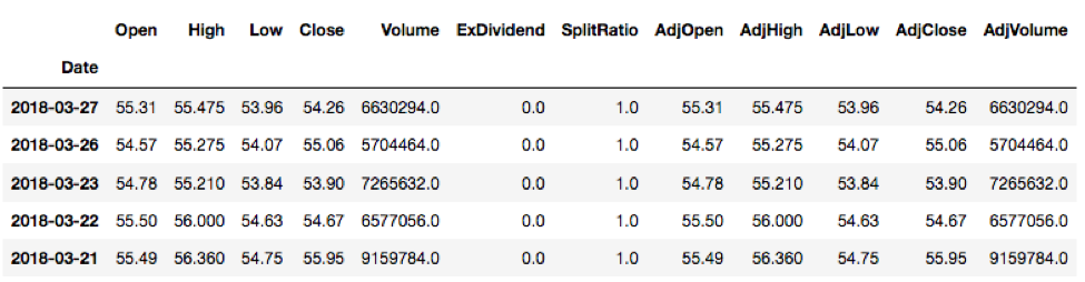
Let’s take a look at the first 5 rows of our delta data {delta.head( )}. The head( ) method, by default, will display the first 5 rows but we can pass in a custom number of choice to control the number of rows being displayed. If we want to see the first 7 rows of the delta data, we can just simply pass in ‘7’ {delta.head(7)}.
We can see all different factors across columns (Open, High, Low, etc) and different dates across rows.
![]()
If we want to see the last 5 rows of the data, simply try {delta.tail( )}. Try it yourself! Very intuitive, isn’t it? The head( ) method is for viewing the top/first ‘n’ number of rows and the tail( ) method is for viewing the last ‘n’ number of rows.
Let’s now grab the data for Jet Blue (JB) and Southwest (SW). The ticker symbol for Jet Blue is ‘JBLU’ and for southwest airline is ‘LUV’.

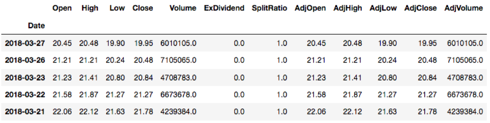
To view the first 5 rows of Jet Blue data:

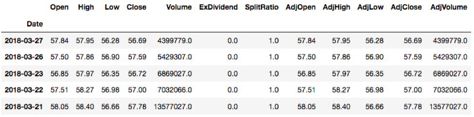
To view the first 5 rows of Southwest data:
![]()
Now that we have our different stock data for these three airline companies, let’s move on to plotting them.
Part 3: Visualizing the Data
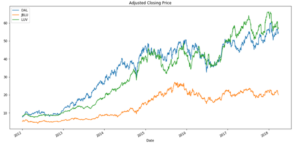
Let’s take a look at the profile of adjusted closing prices on these data (‘AdjClose’ column).
How would you plot the volume data?
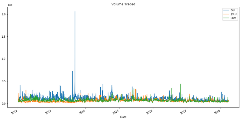
Just by glancing at the graph above, it looks like Delta had a really big spike in volume somewhere in late 2013. What was the date of this SPIKE in trading volume for Delta?
To look for that corresponding date, use idxmax( ) method.
What happened that day?
Upon googling this date (September 10, 2013) with “Delta Air Lines”, you will come across the announcement made on this date that Delta Air Lines would be an official airline partner for both Seattle sport teams, NFL’s Seattle Seahawks and MLS’ Sounders FC. This partnership would financially benefit Delta Air Lines, and would cause more interest for an investment opportunity in Delta; it would likely influence the huge spike of the trading volume.
If you’re feeling confident about Pandas, you may be ready to fetch other stock data to explore on your own and perform many different time series analyses.
Moving average: One of the analyses you can first look at is moving averages (MA), which is commonly used to identify trading opportunities. It is calculated by taking the mean or average of the past data points of the prices. It is called a moving average, as opposed to just an average, because the data set is continuously “moving”: the oldest data points are dropped from the data set to account for the new data as they become available.
Depending on the type of investor or trader (high risk vs. low risk, short-term vs. long-term trading), you can adjust your moving ‘time’ average (10 days, 20 days, 50 days, 200 days, 1 year, 5 years, etc). The two widely MAs that traders and investors used are 50-day MA and 200-day MA.
Essentially, the moving average graph is a smooth line that follows the day-to-day values of the prices we are tracking but it has some lags. Which MA (50-day MA or 200-day MA) do you think will have a greater degree of lag? Exactly, 200-day MA since it contains the prices for the past 200 days.
So, going back to our airline example, let’s graph the 50-day MA, which averages out the adjusted closing prices for the past 50 days, and 200-day MA, which averages out the adjusted closing prices for the past 200 days.

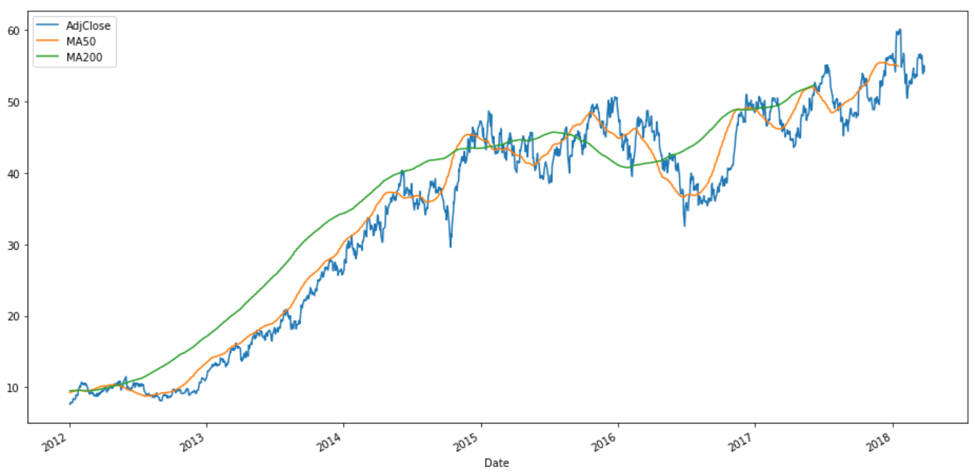
Indeed, the profile of 50-day MA for Delta is different from that of 200-day MA. Again, the information you want to extract depends on whether you are interested in long or short-term investment. There is no one ‘right’ answer. Are you planning to buy when the trend is going down and sell when the trend is going up? (Potentially making a short-term quick cash) Or, hold for a more long-term investment?
Feeling confident regarding the tools of time-series data analysis? Why don’t you put your new Pandas skills to work by exploring stock or other data (perhaps even monetarily profiting while you do)?
Written by Khaing Win, Ph.D. in Neuroscience
Khaing, a neuroscientist by training, is currently a Jr. Python Full Stack Developer (and Data Engineer) at Byte Academy. She has worked with clients in the Blockchain and Data Science Space. Her current project includes using a convolutional neural network for landmark image recognition in the deep learning sector.
Photo by Chris Liverani on Unsplash
_____
If you're looking to delve deeper into either Python or Data Science, be sure to check out our courses here!